I'm a big fan of vintage color design.
When I started out as a Graphic Designer 16 years ago, I didn't have any color sense to speak of. I was doing spot-color work, where I was forced to work in a limited palate of 1-6 colors. (And often 2-3 colors.)
At first, I'd just use colors like red, black, and green. Primary colors, or at best, secondary ones.
After a while, I was really feeling my limitation with my color design skills, and remembered the art history section that I took. The paintings of the masters (and certainly others) already had figured out some great color combinations and design.
Basically, I realized that there was a world of great color design out there, if I just stared looking for it.
After that, I started saving magazine clippings (it was the "Old 90's" after all) and started to learn more and more about interesting color combinations.
Now, I'm no master of color (still learning) but I have a lot more confidence about how to put colors together, and what kinds of things work for the project that I'm working on.
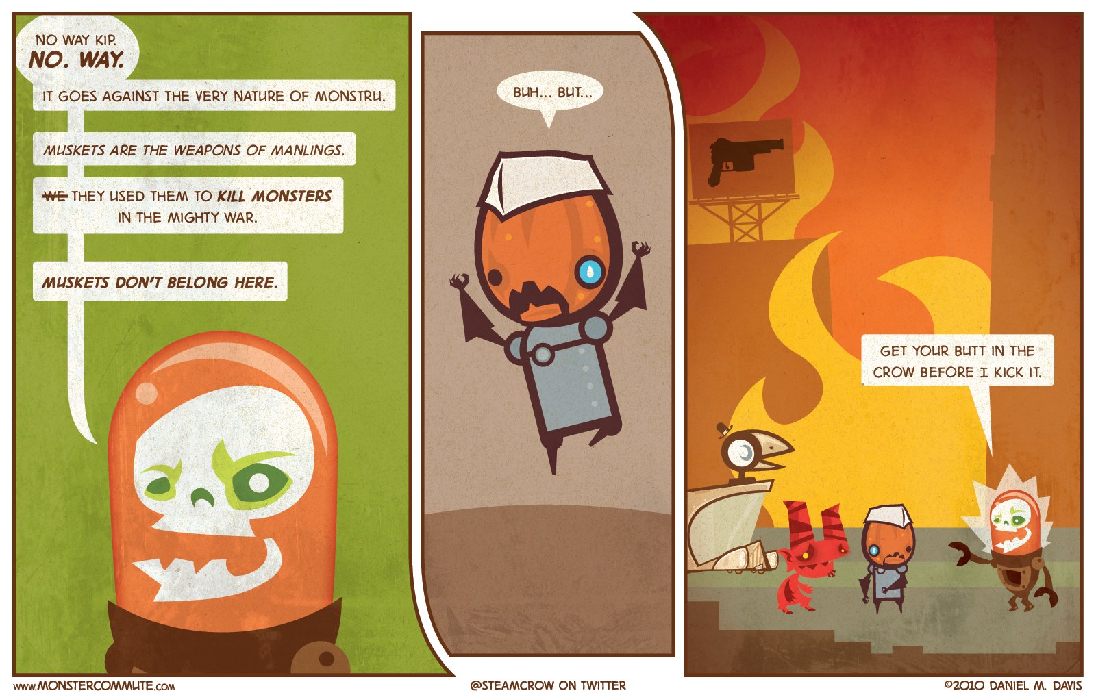
I bring this up because you may have noticed that I'm slowly desaturating the colors in the last couple weeks of strips. I realized that my colors had slipped into a more and more vibrant (crazy) colorspace, and I really wanted to pull them back to a conscious choice of color.
In this case, a more "arts and crafts" sort of palate, more reflective of nature.
And yeah, there will still be some crazy colors about; but also some less "glow in the dark" colors too.
I couldn't imagine doing Monster Commute (or showing Monstru) in a black and white palate; Can you?
- Daniel